Three apps. Still wrong.
Every cyclist knows the routine: check three weather apps, cross-reference wind direction, guess at feel temperature, and still get it wrong. General weather apps don’t speak the language cyclists think in.
Wind direction matters more than speed. Feel temperature matters more than actual temperature. The hour-by-hour breakdown matters more than the daily forecast. No existing app prioritized these inputs — so riders were left assembling their own forecast from scattered sources.
”It’s not about the number. It’s about what the number means at 6am on a bike.”
We rode with cyclists across disciplines — road, gravel, commuter — and asked them to narrate their pre-ride weather check in real time. The patterns were consistent: nobody trusted a single source, everyone had a mental model for translating general forecasts into cycling conditions, and that translation was where the friction lived.
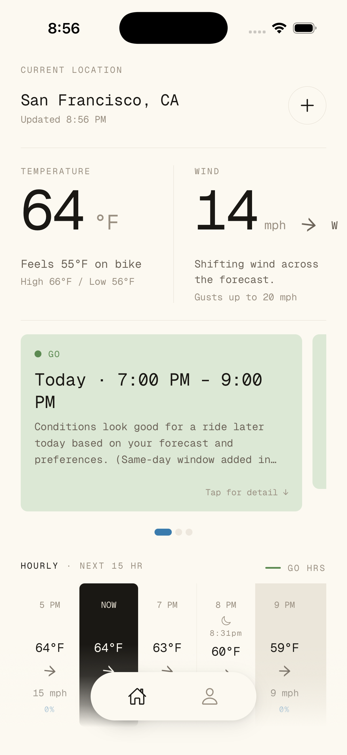
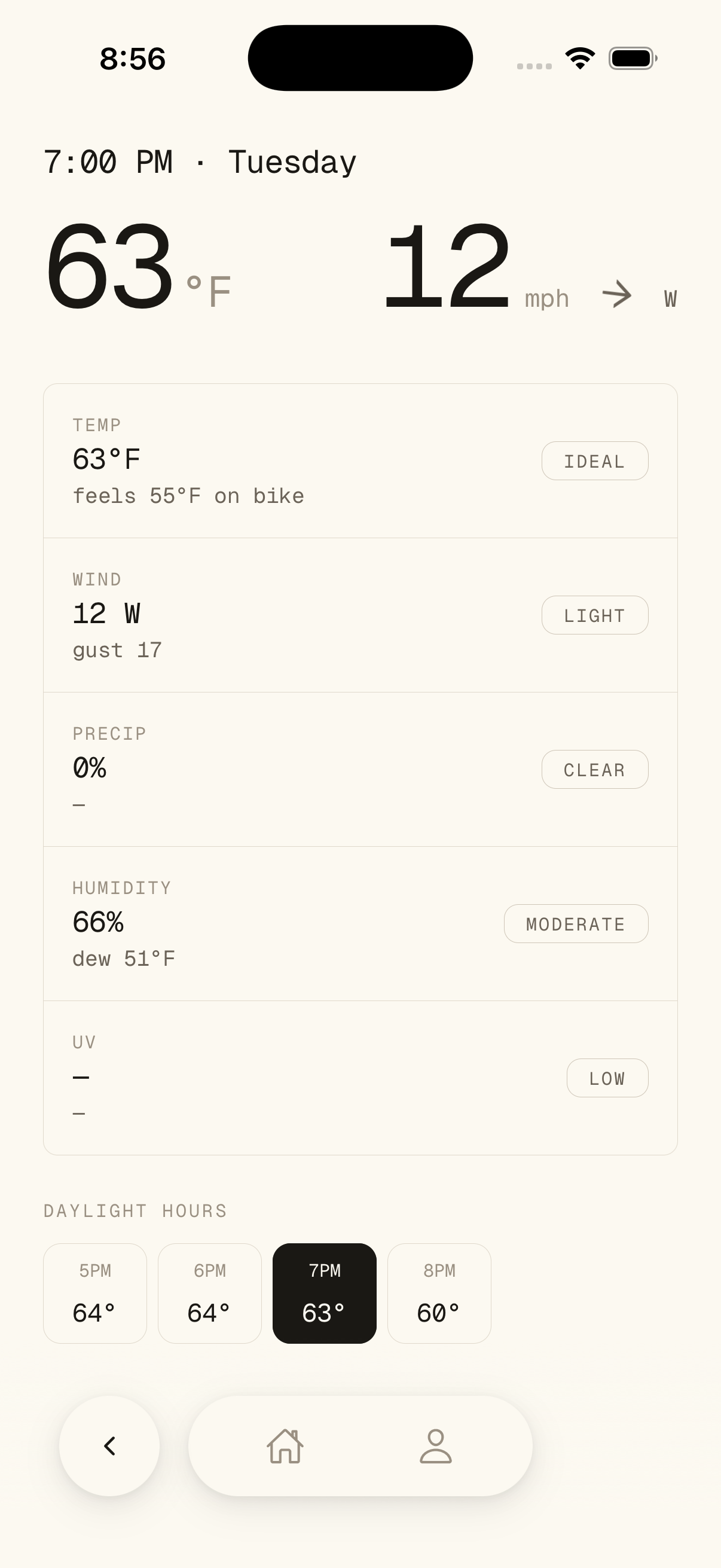
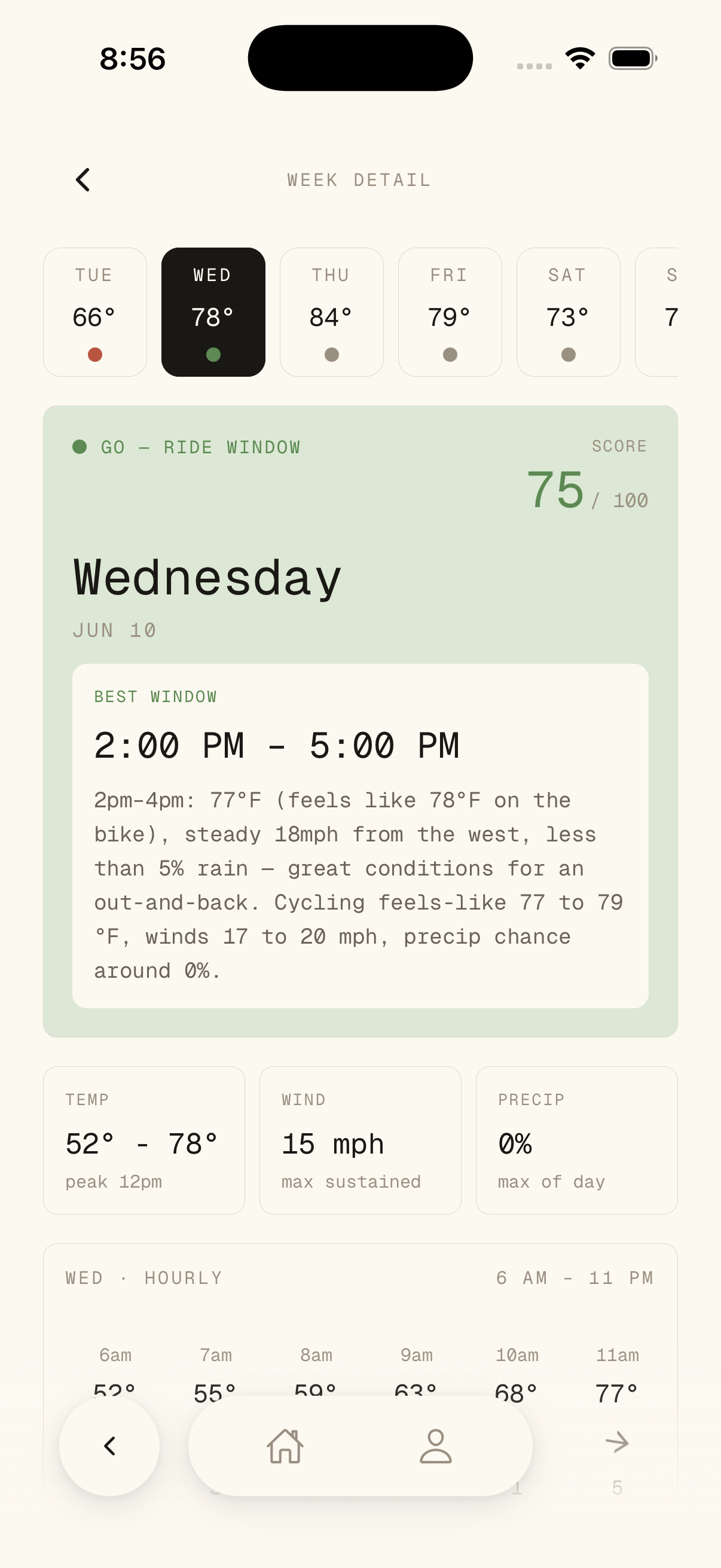
Wind was the universal variable. Not wind speed — wind direction relative to the route. A 15mph headwind on the return leg changes the ride. A crosswind on an exposed descent is a safety decision. No weather app surfaced this.
Your tolerance isn’t everyone’s tolerance.
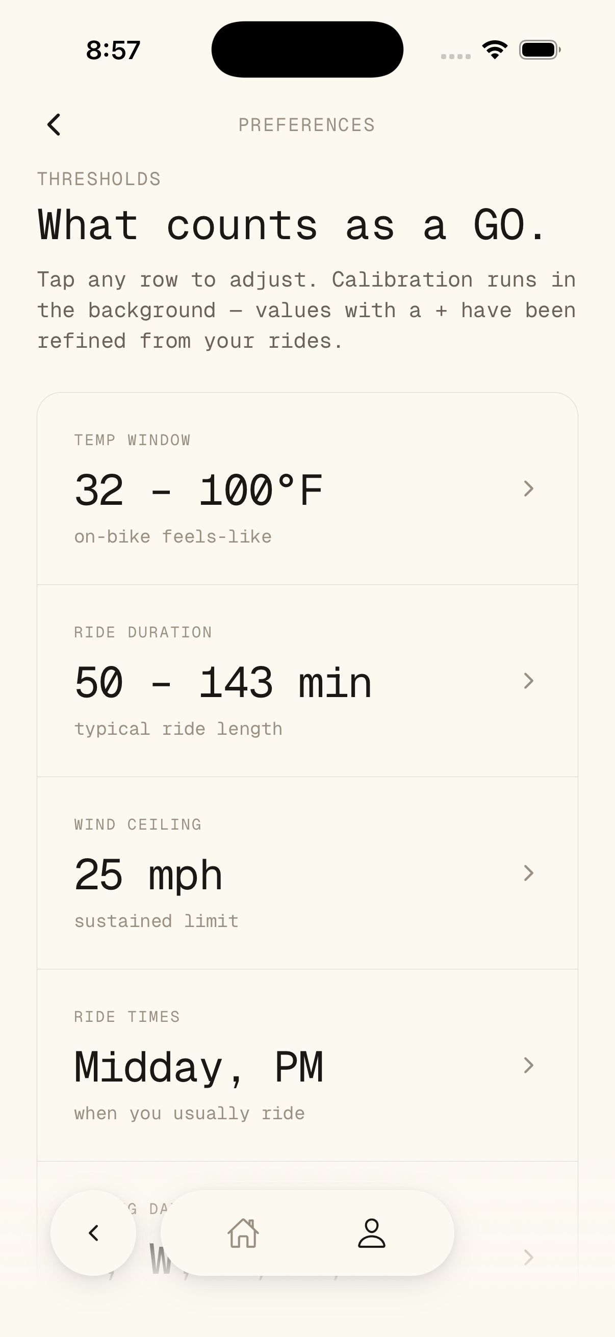
A roadie in Arizona and a commuter in Portland have different thresholds for what constitutes a “cold” ride. The onboarding calibrates VeloVane to the individual — their sensitivity to wind, their comfort range, their typical ride times.
This isn’t preference-setting for the sake of personalization. It’s the foundation that makes every forecast meaningful. The same 45°F morning gets a different recommendation depending on who’s asking.
See what matters. Decide. Ride.
The main interface was designed for a single question: should I ride now? Wind direction and feel temperature are front-and-center. The hour-by-hour breakdown shows how conditions evolve — so a rider can pick their window.
Data visualization had to be instantly readable, not analytically dense. Color, position, and scale do the communication. The rider glances, decides, and closes the app. That’s the measure of success.
Built for cyclists. Not dressed up for them.
The brand needed to signal expertise without the visual clichés of the cycling industry — no aggressive angles, no neon gradients, no stock photography of pelotons. VeloVane’s identity is calm, precise, and functional. It earns trust by looking like it knows what it’s doing.
Typography is clean and data-friendly. The color system supports the data visualization without competing with it. The overall feel is closer to a precision instrument than a fitness app.
One app. No second-guessing.
Cyclists open VeloVane, see what matters, and decide. The data does the thinking so the rider can do the riding. The three-app routine is gone — replaced by a single source that speaks the rider’s language.
The app earned its place not through marketing but through utility. Riders recommend it to other riders because it solves a real problem they all share. That’s the best signal a product can get.