A $6,000 guitar built in silence.
Clients commission a custom guitar and then wait. Months pass. The work is real — the shaping, the jointing, the finishing — but from the client’s side, none of it is visible. The wait isn’t the problem. The silence is.
Wiley Guitarworks was building instruments of genuine craft and care and communicating about them the way everyone does: texts, iMessages, whatever channel happened to be open. Updates were scattered. Photos lived in threads. The story of each build was happening — no one was telling it.
The brief wasn’t “build an app.” It was: how do you make a client feel connected to something being made for them — by hand, over months — before they can hold it?
”They didn’t want more updates. They wanted to feel like they were there.”
We conducted narrative interviews with luthiers and clients separately — not to gather data points, but to understand the emotional texture of the wait. What came back was consistent: clients weren’t frustrated by the timeline. They were disconnected from it.
Build photos were among the things they valued most, but those photos were buried in iMessage threads with no context, no sequence, no story connecting them.
On the builder’s side, updates weren’t being withheld — they were being sent into a void. Posting an update over text felt transactional. There was no place that held the narrative. So updates happened less often than they should have, and the emotional distance between builder and client quietly widened.
”This wasn’t a communication problem. It was a narrative problem.”
Early assumptions pointed toward a messaging tool — a cleaner, more branded channel between builder and client. The research redirected us quickly.
The issue wasn’t the medium. It was the absence of continuity. Clients didn’t lack messages — they lacked a place where the story of their instrument could unfold in sequence.
This reframed the entire design problem. We weren’t designing a better inbox. We were designing an experience — one where the waiting period itself becomes part of what the client receives.
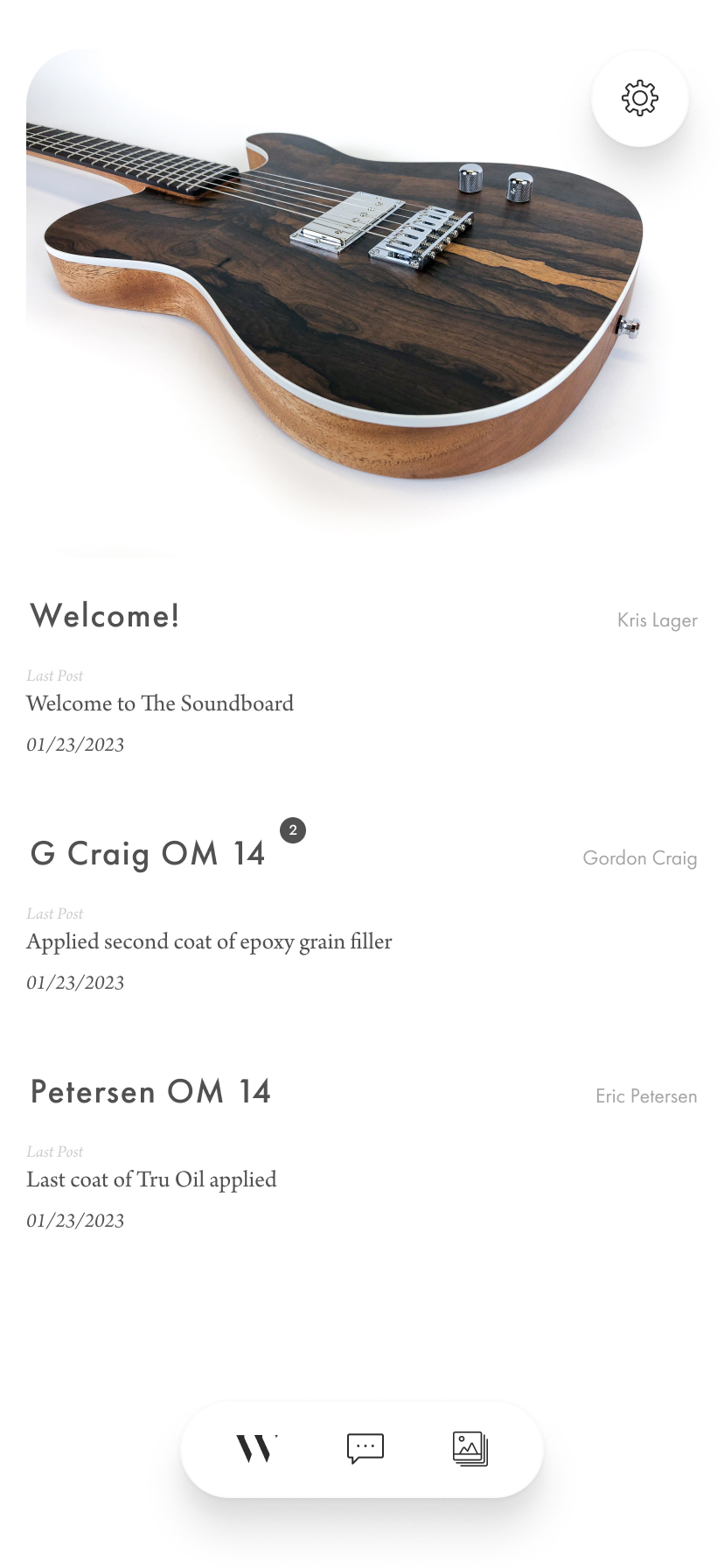
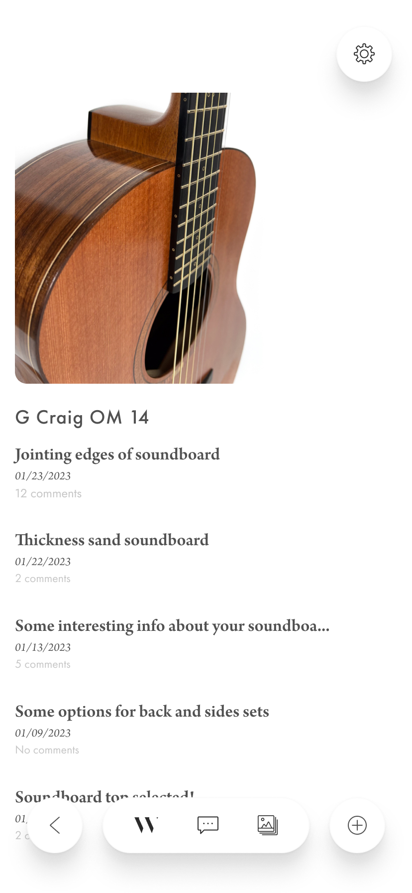
The build journal is the product.
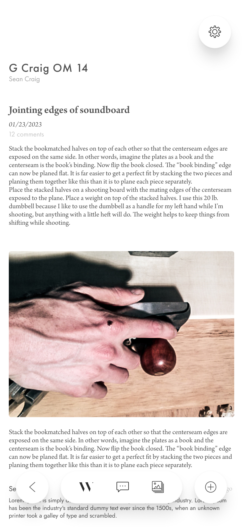
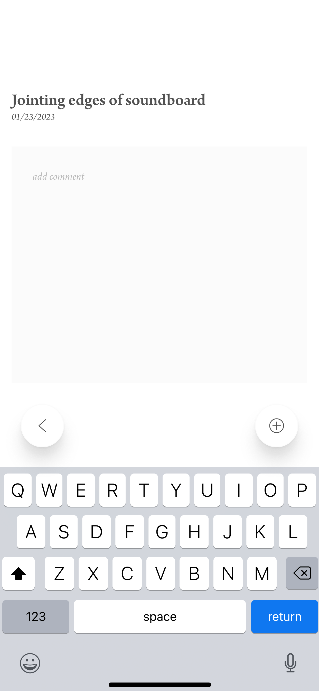
Most client portal thinking starts with messaging. We started with documentation. The builder posts to the build journal first — a photo, a title, a few lines about what happened at the bench that day. The conversation follows from that.
Posting had to cost less than sending an email. If sharing a build update is slower than a text, it won’t happen — and the experience breaks. The compose flow was stripped to the minimum: title, content, and a photo. Nothing more.
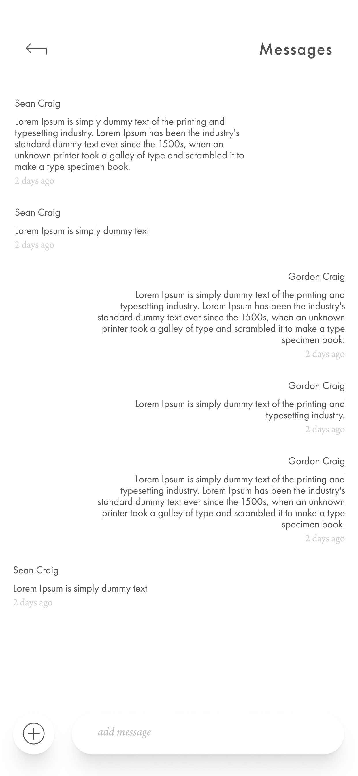
Follow the build. Leave a comment. That’s it.
The client-facing view was designed to feel like reading a journal, not managing a project. No dashboards, no ticket queues, no status fields. The client sees a chronological record of their instrument taking shape — photography up front, the builder’s voice present in every post.
The interaction model is deliberately constrained. Clients can react and comment — but the platform makes clear that the builder leads and the client follows. That hierarchy isn’t limiting. It’s what makes the experience feel curated rather than collaborative in the wrong direction.
Strip away Guitarworks and it could be a watch company. That’s the point.
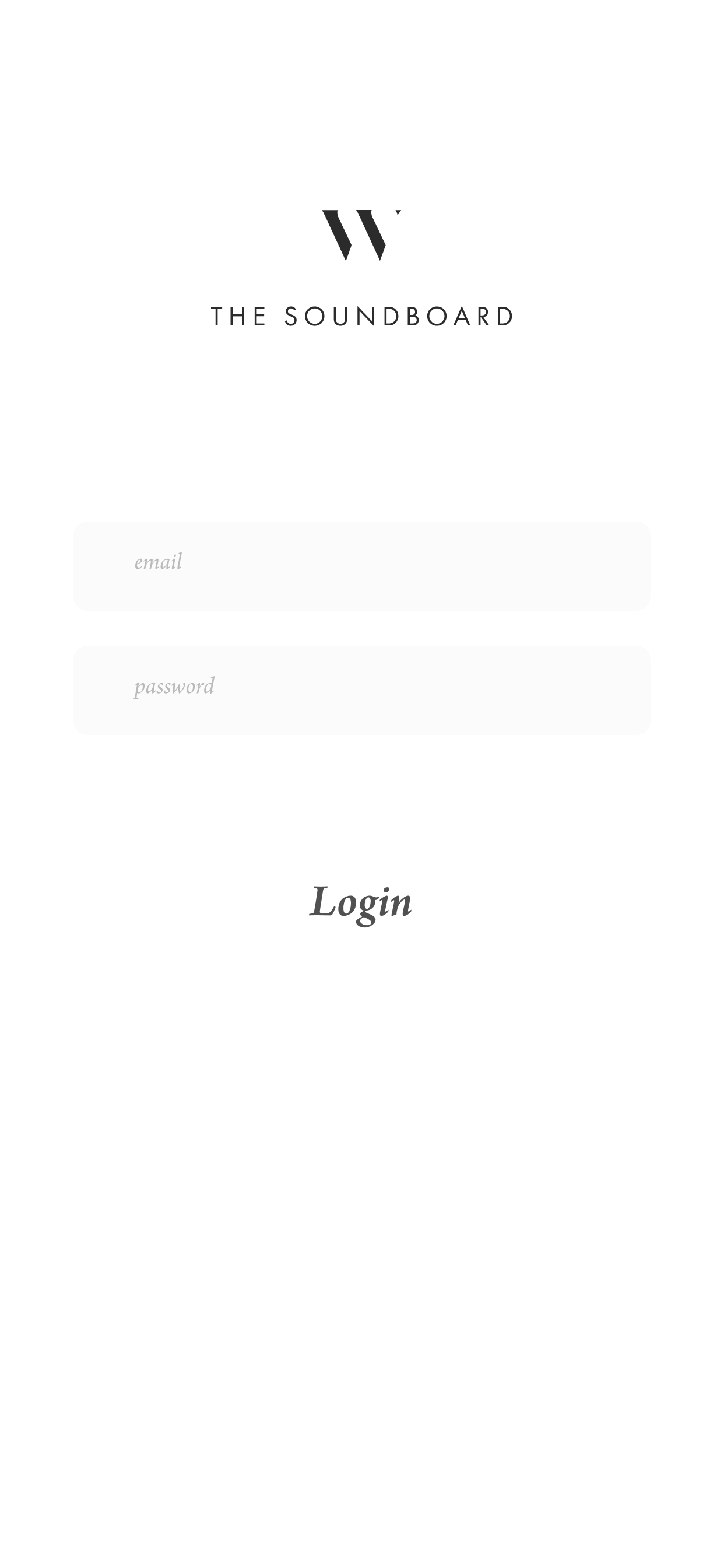
Wiley Guitarworks occupies a specific kind of brand space — modern, minimal, and unmistakably luxury. The kind of identity that doesn’t need to announce what it is.
The Soundboard had to earn its place in that world. Not just complement the brand — inhabit it. Every interface decision was made against that standard: would this feel at home in a WGW campaign, or would it feel like software?
The UI carries the same restraint and confidence as the brand it serves — because a $6,000 instrument deserves a platform that treats the experience of commissioning it with equal seriousness.

Clients stopped counting the days. They started looking forward to them.
The clearest signal came not from metrics but from behavior: clients began mentioning The Soundboard unprompted — in conversations with friends, in the commission inquiries those friends sent. Referrals increased. Existing clients came back to commission second instruments, and several cited the build experience specifically as the reason.
The waiting period — once a communication gap to manage — became a designed experience in its own right. Clients weren’t just receiving a guitar at the end. They were receiving the story of it being made for them.